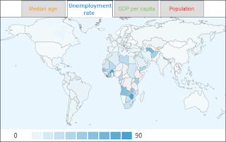
The following heat maps display two variables, the median age (years) and the unemployment rate (%), of countries by using colors on the world map (data source: CIA's World Factbook).

It depends: If your target is to visualize every single variable clearly, the concept works. If your target is to help your audience understand the relationship between variables, then an XY chart works better (such as Google's motion chart--here without the animation):
Let's analyze: By average, the lower the median age is in a country, the higher the unemployment rate.
UPDATE (Thursday, April 17, 2008):
Included below a more traditional chart to display the relationship between median age and unemployment rate. In this chart, countries are grouped in median age groups. An average unemployment rate is calculated for each group.


2 comments:
"Let's analyze: By average, the lower the median age is in a country, the higher the unemployment rate."
I think you've oversimplified; your concluded relationship implies a smooth monotonic relationship. I see two distinct lines. One line is approximately horizontal at an unemployment level in the single digit perceentages, ranging from ages of low 20s to mid 40s. Another line is approximately vertical at age 18 ranging from near 0% to 100%.
Jon, I admit having made this too simple. Included in this posting a new chart to display the data. I see a relationship between the variables, when the median age is 26 years or less.
Send me email, if you want the original data.
Post a Comment