Sunday, November 25, 2007

Adding value to sales data: willingness to use service again

Among other things this blog is about saving advantageous solutions for future use. After writing the previous posting Viewing sales data by using XY charts, it came into my mind to compose a more general solution how to add value to your sales data.

Let's start with the following sales table (same as before, products A-Z, etc):

CREATE TABLE salesdata (
product VARCHAR(1),
customerno INTEGER,
market_area INTEGER,
day DATE,
quantity INTEGER);

By using the salesdata table, we create a new table salesdata_prod_cust_pair that summarizes sales for each product-customer pair within a season.

CREATE TABLE salesdata_prod_cust_pair (
product VARCHAR(1),
customerno INTEGER,
market_area INTEGER,
first_day_overall DATE,
first_day_season DATE,
next_day DATE,
count_season INTEGER,
quantity_season INTEGER,
new_customer_flag INTEGER,
use_again_flag INTEGER,
use_again_days_between INTEGER);

The following SQL populates the table:

/* Explore season 2007-Q1 */
INSERT INTO salesdata_prod_cust_pair

SELECT s.product, s.customerno, s.market_area,
MIN(overall.min_day) overall_first_day,
MIN(s.day) seasonal_first_day,
MIN(seasonal_next.next_day) next_day,
COUNT(*) count_season,
SUM(s.quantity) quantity_season,
1-SIGN(DATEDIFF(MIN(s.day),MIN(overall.min_day))) new_customer_flag,
SIGN(DATEDIFF(MIN(seasonal_next.next_day),MIN(s.day))) use_again_flag,
DATEDIFF(MIN(seasonal_next.next_day),MIN(s.day)) use_again_days_between
FROM salesdata s

LEFT OUTER JOIN(
SELECT nxt.product, nxt.customerno, MIN(nxt.day) next_day
FROM salesdata nxt,
(SELECT product, customerno, MIN(day) min_day
FROM salesdata
WHERE day >= '2007-01-01'
GROUP BY product, customerno) q
WHERE nxt.customerno = q.customerno
AND nxt.product = q.product
AND nxt.day > q.min_day
GROUP BY nxt.product, nxt.customerno) seasonal_next
ON s.product = seasonal_next.product
AND s.customerno = seasonal_next.customerno,

(SELECT product, customerno, MIN(day) min_day
FROM salesdata
GROUP BY product, customerno) overall

WHERE s.product = overall.product
AND s.customerno = overall.customerno
AND s.day BETWEEN '2007-01-01' AND '2007-03-31'
GROUP BY s.product, s.customerno, s.market_area;

Please note that you must change red texts according to your database. DATEDIFF() returns days between two dates. 2007-01-01 and 2007-03-31 specify the season to explore; in this case 2007-Q1.

Here's some data:


As you can see:
  • Product A was sold to Customer 4 first time in May 2006, so C-4 is not a new customer during season 2007-Q1, therefore new_customer_flag = 0.
  • Product A was sold to Customer 13 first time on January 5th, 2007, so C-13 is a new customer during season 2007-Q1, thus new_customer_flag = 1. This customer used the product/service again on March 8th, so use_again_flag = 1 and use_again_days_between = 62.

OK. This was only the first part. By using the new salesdata_prod_cust_pair table, you can write in SQL:

SELECT product,
SUM(quantity_season) "Total quantity of items sold",
100*SUM(new_customer_flag)/COUNT(*) "% new customers in this season",
100*SUM(use_again_flag*new_customer_flag)/SUM(new_customer_flag) "% willingness to use product/service again",
AVG(use_again_days_between/new_customer_flag) "Average days before using
product/service again"
FROM salesdata_prod_cust_pair
GROUP BY product;

.. and get the following results:

See the last two columns! For example the willingness to use product/service again is an excellent indicator to monitor how much your customers trust your products.

By using an XY chart you can visualize the data:

Let's analyze:

  • There must be some problem in products U and B. Marketing might be ok (42% new customers), but once used the first time, only 10 % of customers are willing to use the service again.
  • The product C is in the other extreme. When customers use it, they probably love to use it again. Perhaps the teams responsible for products U and B can learn something from the team C?

I think I'm done with the sales data for now. Next time, something else.

Sunday, November 4, 2007

Viewing sales data by using XY charts

An XY chart (scatter plot) can express more than a typical bar or line chart. Here's an example how you can utilize typical sales data and create two interesting XY charts that help your decision making processes.

Suppose you have a typical sales table:

CREATE TABLE salesdata (
product VARCHAR(1),
customerno INTEGER,
market_area INTEGER,
day DATE,
quantity INTEGER);

.. that contains row-level sales data like this (product names A-Z, market areas 1-12):


By using the data, you usually create charts like this:


.. and for sure this chart is informative in many ways.

Now suppose you are interested in knowing more about products and market areas. For example: what is the average quantity of items sold in this season (Y), and how many of the customers bought the product for the first time (X).

You can get the data by using the two following SQL queries (this season = 2007):

/* XY for products */
SELECT s.product,
AVG(s.quantity) "Average quantity of items sold",
100*SUM(1-SIGN(ABS(s.day-q.min_day)))/COUNT(*) "% new customers in this season",
SUM(s.quantity) "Total quantity of items sold"

FROM salesdata s,
(SELECT product, customerno, MIN(day) min_day
FROM salesdata
GROUP BY product, customerno) q
WHERE s.product = q.product
AND s.customerno = q.customerno
AND s.day >= '2007-01-01'
GROUP BY s.product;


/* XY for market areas */
SELECT s.market_area,
AVG(s.quantity) "Average quantity of items sold",
100*SUM(1-SIGN(ABS(s.day-q.min_day)))/COUNT(*) "% new customers in this season",

SUM(s.quantity) "Total quantity sold in area"
FROM salesdata s,
(SELECT product, customerno, MIN(day) min_day
FROM salesdata
GROUP BY product, customerno) q
WHERE s.product = q.product
AND s.customerno = q.customerno
AND s.day >= '2007-01-01'
GROUP BY s.market_area;


Now the charts:


Let's analyze:
  • Products clearly have different profiles. Product F is favored by old customers, while products L and T have recently found many new customers. In a single sales transaction, product U is sold by average nearly twice as much as D.
  • Symbol size is the total quantity sold. There are no big differences in the sales of different products. More difference exist in various market areas: area 1 is the most important, while areas 9, 10, and 11 are the smallest. (I created the data by using a random function.)
  • All market areas have almost the same "average quantity of items sold". The market areas differ more in X axis: in area 1 only 18% are new customers, while in areas 10 and 12 almost half of the customers are new. Perhaps the company just started marketing in areas 10 and 12?

All this is interesting -- no less so because the basic line chart cannot express this knowledge.

Nevertheless it must be said that these charts don't yet tell anything about the prospects in different market areas. Adding facts about market area size (for each product) would help your decision making where to target your marketing in the next season.

Therefore, don't be satisfied with line and bar charts, if you can improve your decision making by using XY...

Tuesday, October 23, 2007

Age pyramid models

In the recent days I've read with great interests Jorge Camoes' blog about his Excel Demographic Dashboard and attempts to enhance it with Crystal Xcelsius. The Excel dashboard even contains two animated reports that help you see how the age structure in various countries and continents will change between years 1995 and 2050.

First, thanks for the information! The dashboard opened my eyes to see that the trend of growing average age is valid everywhere, including African countries (not only in Europe).

Second, thanks for a good sample! This well-documented test helps us compare BI softwares against each other.

Jorge's recent post discusses different approaches to create population pyramids with Excel (XY chart) and Crystal Xcelsius (stacked bar). Excel approach appears to me more flexible, because it allows you to draw several lines (several countries) into same age pyramid. Xcelsius falls short because Xcelsius-XY chart doesn't draw lines (only data points).

Well, let me add one more approach to the age pyramid problem.


I created the four age pyramid models by using (not XY or stacked bar but) the Sheet tool in Voyant. The software allows you to format a cell (to be precise, a column of a sheet) to display a bar or a line (instead of the number it contains).

Benefits of this approach? It's the flexibility to mix numbers and graphics together. For example, if you need more space for bars or lines, numbers will immediately move to the right, because they are part of the same sheet.

OK.

From now on, a link to Jorge Camoes' BI Blog is provided under my link list.

Saturday, September 22, 2007

Scatter plot found in Helsingin Sanomat

As I have criticized Helsingin Sanomat, the largest newspaper in Finland, for not publishing any scatter plot charts (XY charts), here's one!


It was published on Friday 21st September 2007 (the first XY during my blog).

The data: Number of economic reforms made (x) and economic growth rate (y) since 1989 when communism collapsed in Eastern Europe. Blue circle = European Union member state.

It's easy to see that it pays off for a state to join EU.

That's a powerful message displayed clearly. No other graph would have done that this well.

Sunday, August 12, 2007

Observations about Edward Tufte's classic The Visual Display of Quantitative Information

More than two months ago I read a book The Visual Display of Quantitative Information by Edward Tufte.

Many already know this classic (1st edition 1981, 2nd 2001) that introduces the first theoretical view of statistical graphics. Instead of writing a full review, I will tell what I liked most.

In the end of this post, you'll also find a comparison of this book and Stephen Few's Information Dashboard Design.


1. History

I enjoyed reading where all started. We don't know who invented traditional Chinese characters. We know only according to legends that the inventor of Greec alphabet was Cadmus. But for sure we know who invented line and bar charts. He was William Playfair (1759-1823). Here's one of his piece of art (its copyright has expired):


For Playfair, graphics were preferable to tables because graphics showed the shape of the data in a comparative perspective. The line chart easily contained data of hundred years displaying for example imports and exports or the national debt of Britain. Colonial wars caused rises and falls thus proving that the government policy has its economic consequences.

2. More history

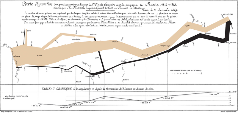
The book contains many other examples of graphical art too. As in early days every graphic was cut into metal or stone surface as a mirror image, surely each piece of graphic is more valuable and special compared to our moders graphics. Here's a masterpiece from Charles Joseph Minard (its copyright has expired):


The well-known graphic shows the terrible fate of Napoleon's army in Russia during 1812-1813. Starting from Poland on the left the size of the army is 422,000. While going towards east the width of the gray band indicates the diminishing size of the army at each place on the map. In Moscow there are 100,000 men left. Going back to Poland the dark line becomes thinner and thinner thus displaying devastating losses. In Tufte's words: It may well be the best statistical graphic ever drawn.

3. Scatterplots

Tufte uses 23 pages of 197 (11.7%) to talk about XY charts. I'm impressed about the difference he makes between XY and other charts, because I feel the same. Tufte's words: [...] the scatterplot and its variants ... [are] the greatest of all graphical designs. It links at least two variables, encouraging and even imploring the viewer to assess the possible causal relationship between the plotted variables.

In fact, when I read Helsingin Sanomat, the largest newspaper in Finland, I from time to time see it losing the possibility to use XY. The following image was published by the newspaper about the population growth rate in twenty cities of Finland (translated in English).


Here is my view of the same data by using a scatterplot:


Some cities grow fast (top-right corner) both because of natural population growth and positive net migration, while for example the lowest city Kajaani has a problem with negative net migration (-5%). A national decision-maker would appreciate this XY chart, as it clearly shows which cities are alike and which aren't.

4. Small multiples

Small multiples is something I haven't paid attention, when I was a programmer. The idea is great. See how much information is contained in the following set of charts.


Unfortunately, to create small multiples with a modern charting application is far from straightforward. For example, when composing the sample image above, I had to size and position six charts precisely to form a satisfactory result. Another bad point: Individual charts tend to have a different automatic scale in Y axis, which is a problem, when you quickly try to get grip of the data.

5. New concepts introduced

To me it's fun to learn what concepts others have invented. In this book Tufte introduces a couple of them, of which the data-ink ratio is most well-known: above all else show the data, maximize the data-ink ratio, erase non-data-ink and redundant data-ink, revise and edit.

Other concepts such as lie factor and data density I also find interesting. Lie factor: show data variation, not design variation. Data density: the small multiples chart above is an example of a high-information graphics = you don’t have to repeat titles or legends for every individual chart.

Data visualization books in comparison

As I have previously reviewed Stephen Few's Information Dashboard Design [link] that also discusses about data visualization, here's my observations how these great books differ:


By the way, there are newer books from Tufte available such as Beautiful Evidence, but I haven’t read it yet.