 More than two months ago I read a book The Visual Display of Quantitative Information by Edward Tufte.
Many already know this classic (1st edition 1981, 2nd 2001) that introduces the first theoretical view of statistical graphics. Instead of writing a full review, I will tell what I liked most.
In the end of this post, you'll also find a comparison of this book and Stephen Few's Information Dashboard Design.
1. History
I enjoyed reading where all started. We don't know who invented traditional Chinese characters. We know only according to legends that the inventor of Greec alphabet was Cadmus. But for sure we know who invented line and bar charts. He was William Playfair (1759-1823). Here's one of his piece of art (its copyright has expired):

For Playfair, graphics were preferable to tables because graphics showed the shape of the data in a comparative perspective. The line chart easily contained data of hundred years displaying for example imports and exports or the national debt of Britain. Colonial wars caused rises and falls thus proving that the government policy has its economic consequences.
2. More history
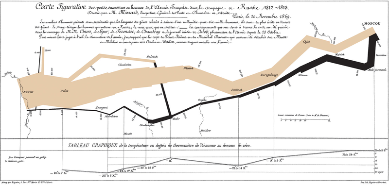
The book contains many other examples of graphical art too. As in early days every graphic was cut into metal or stone surface as a mirror image, surely each piece of graphic is more valuable and special compared to our moders graphics. Here's a masterpiece from Charles Joseph Minard (its copyright has expired):

The well-known graphic shows the terrible fate of Napoleon's army in Russia during 1812-1813. Starting from Poland on the left the size of the army is 422,000. While going towards east the width of the gray band indicates the diminishing size of the army at each place on the map. In Moscow there are 100,000 men left. Going back to Poland the dark line becomes thinner and thinner thus displaying devastating losses. In Tufte's words: It may well be the best statistical graphic ever drawn.
3. Scatterplots
Tufte uses 23 pages of 197 (11.7%) to talk about XY charts. I'm impressed about the difference he makes between XY and other charts, because I feel the same. Tufte's words: [...] the scatterplot and its variants ... [are] the greatest of all graphical designs. It links at least two variables, encouraging and even imploring the viewer to assess the possible causal relationship between the plotted variables.
In fact, when I read Helsingin Sanomat, the largest newspaper in Finland, I from time to time see it losing the possibility to use XY. The following image was published by the newspaper about the population growth rate in twenty cities of Finland (translated in English).

Here is my view of the same data by using a scatterplot:

Some cities grow fast (top-right corner) both because of natural population growth and positive net migration, while for example the lowest city Kajaani has a problem with negative net migration (-5%). A national decision-maker would appreciate this XY chart, as it clearly shows which cities are alike and which aren't.
4. Small multiples
Small multiples is something I haven't paid attention, when I was a programmer. The idea is great. See how much information is contained in the following set of charts.

Unfortunately, to create small multiples with a modern charting application is far from straightforward. For example, when composing the sample image above, I had to size and position six charts precisely to form a satisfactory result. Another bad point: Individual charts tend to have a different automatic scale in Y axis, which is a problem, when you quickly try to get grip of the data.
5. New concepts introduced
To me it's fun to learn what concepts others have invented. In this book Tufte introduces a couple of them, of which the data-ink ratio is most well-known: above all else show the data, maximize the data-ink ratio, erase non-data-ink and redundant data-ink, revise and edit.
Other concepts such as lie factor and data density I also find interesting. Lie factor: show data variation, not design variation. Data density: the small multiples chart above is an example of a high-information graphics = you don’t have to repeat titles or legends for every individual chart.
Data visualization books in comparison
As I have previously reviewed Stephen Few's Information Dashboard Design [link] that also discusses about data visualization, here's my observations how these great books differ:

By the way, there are newer books from Tufte available such as Beautiful Evidence, but I haven’t read it yet.
3 comments:
Janne:
A scatter plot is not an obvious chart format in the media because a) journalists don't understand them; b) they think the audience doesn't understands them. And you can't take the risk of losing a reader just because you think a scatter plot is a better chart, do you? (Of course this is a dangerous generalization.)
Probably b).
Anyway Tufte says in page 82: "relational graphics [...] there is evidence that twelve-year-old children understand the design" [relational graphics = scatterplots]. He also includes a reference to the original study "Interpretation of Graphs at Elementary School Level".
It's not b). I sent the blog link to the subdivision responsible for publishing images in the Helsingin Sanomat newspaper.
The chief soon responded that the graphic format is often already decided when they get the data from the experts of the appropriate area of knowledge. Graphic designers are usually happy to use that format (they don't try any other formats based on the data). The designers don't have any recommendations or policy to avoid XY.
Post a Comment