Sunday, April 29, 2007

Self-drilling and finite state machines, does your OLAP tool support them?

Self-drilling, drilling down to itself, is an interesting concept in business intelligence reports. Among many things, it allows your OLAP tool to turn into a simulation tool much like Crystal Xcelsius. See the following video:


In the video, I'm working with the Voyant OLAP tool and a line chart. I click several times a meter control = the simulated change percent for the last three months of the year (between -100% and +100%). When clicking, the forecast (green line) moves accordingly.

How did I do it? Self-drilling is the key.

Step-by-step (please try it with your OLAP tool):

1. Create a new table: CREATE TABLE sim_change_percent (change_percent INTEGER)

2. Populate the table with integers between -100 and 100 = 201 rows.

3. Define a query for your report: SELECT choice.change_percent "Choice", display.change_percent "Display" FROM sim_change_percent choice, sim_change_percent display WHERE choice.change_percent <> display.change_percent

Please note that the two instances of the sim_change_percent table "choice" and "display" are joined by <> operator. The query produces 201 x 200 rows = 40 200 rows.

4. Create a stacked column graph where you use:
  • Legend of the chart = measure dimension = COUNT(*)
  • Category axis = Display column of the query
  • Menu choice/filter = Choice column of the query
The report looks like this:


Note that every column height is one (that's because of COUNT(*)). Also note that when you have chosen a zero percent from the menu choice/filter above the report, the corresponding column is missing from the chart (that's because of the <> operator).

5. Add a formula/calculation to the measure dimension: 1-[count]

This fills the gap in the stacked column chart. Because there are two members in the legend, you can use different colors for them to show which one is selected. The next image shows colors changed and boundary lines removed.

6. Now to self-drilling: Whichever way it's done in your OLAP tool, specify that clicking a column drills down to the menu choice/filter of the same report.

In Voyant, you do this by specifying interaction options.

7. Change the visual display by removing the legend and both axes. Specify the gap width between columns to 0%. Add explanatory texts (titles, subtitles, footers, etc) around the meter control to make it more comprehensible. Also add a tool tip (called a chart tip in Voyant) to display a change percentage near the mouse cursor.


Thanks to self-drilling, the stacked column chart now looks and performs like a meter control.

Let's continue to the line chart with Actual, Forecast, and Budget:

8. Create a new table: CREATE TABLE sim_money (month INTEGER, actual DOUBLE PRECISION, forecast DOUBLE PRECISION, budget DOUBLE PRECISION)

9. Populate the sim_money table with the following numbers (12 rows):


10. Define a query for your line chart report: SELECT month, change_percent, actual, forecast, budget FROM sim_money, sim_change_percent

The idea of the query above is to not join at all the sim_money and sim_change_percent tables. This cartesian product gives us 12 x 201 rows = 2412 rows.

11. Specify a line chart by:

  • Legend of the chart = measure dimension = SUM(actual), SUM(forecast*(100+change_percent)/100), SUM(budget)
  • Category axis = month column of the query
  • Menu choice/filter = change_percent column of the query
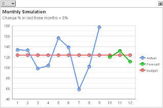
After enhancing the visual display the line chart might look like this:


12. Position the two charts as in the following image, hide the menus, and make them synchronized.


Synchronization means that both reports share a global menu choice/filter (change percentage with 201 choices). Neither of the menus/filters need to be visible, because the meter control enables you choose by clicking.

The simulation model is ready. Please leave a comment, if your OLAP tool is able to do it.

Additional notes about self-drilling:
  • When using self-drilling, you always need a query with a cartesian product.
  • Self-drilling makes simulation models available in OLAP tools. If a report uses two simulation variables, you need two cartesian products in the query, etc.
  • In a larger perspective, self-drilling allows you to create finite state machine models. Transitions between states are performed by mouse clicks.
  • A finite-state-machine way of thinking allows you to create versatile navigational systems. This includes a simple expert system, where a series of questions and answers help a user solve a specific problem. For example, rows of a sheet contain different choices (answers) that take you to the next state (the next question and the next set of answers).
  • Because of one or more cartesian products that exist behind self-drilling systems, the number of rows included in calculation grow easily very large. Thus, OLAP tools that store all the data in RAM become more easily out of action. Self-drilling works best with online data access from a database.

PS. Self-drilling as an idea and as a term are my independent inventions, as well as the ways to utilize the concept. Please leave a comment, if you know somebody uses a different terminology about the matter.

Sunday, April 22, 2007

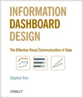
A great book about dashboard design by Stephen Few

I read a book from Stephen Few: Information Dashboard Design.

It's a great book. The idea of the book is to explain what makes business dashboards good and informative, and which mistakes we nevertheless often do and create dashboards that don't communicate.

Those of you not familiar with business dashboards I give Stephen Few's definition: A dashboard is a visual display of the most important information needed to achieve one or more objectives; consolidated and arranged on a single screen so the information can be monitored at a glange.

Why this book made me read it? Data visualization has interested me a long time. After all I was in the business for 16 years programming various graphs and making it possible to combine them in a meaningful fashion.

I liked intense discussions with my colleaques criticizing our works, which then of course have to be re-evaluated and reprogrammed, over and over again. The process inevitably increased our knowledge of data visualization. As I have now changed my job, Stephen Few's book is a mirror for me to check where my knowledge is.

Notes about the book:

The author classifies things in a nice way. For example, the dashboard categorization for various roles (strategic, analytical, and operational) made me nod my head in agreement. Yes, for sure these roles have different dashboard design challenges.

In a strategic dashboard, the big managerial picture of your business is important, budgets, actuals, and forecasts, often long terms of time (years, quarters, months), while drilling down into details is not the main issue. In an analytical dashboard, you should see everything that helps you make decisions to follow the current strategic plan, that is, by making many kind of comparisons, drilling down into details, and tracking changes in shorter terms of time (months, weeks, days). Operational dashboards are for monitoring tasks that might need action soon or right now; your interest is in intra-day periods (hours, minutes).

Classifications continue: thirteen common mistakes in dashboards (such as exceeding the boundaries of a single screen), eleven preattentive attributes of visual perception (color, position, form, motion, and their sub-categories--what works and why), the concept of data-ink ratio (eliminate unnecessary non-data pixels, enhance data pixels, highlight most important data pixels), nine graphs that communicate best (such as bar and line charts) and graphs that should be avoided (all area graphs such as pie chart, because our ability to compare 2D areas is not precise). Very thorough.

But the book is not only theory. It contains plenty of examples about good and poor dashboard design. I found amusing the idea of analyzing sample dashboards found from the web sites of software vendors (and a few other sources).

As I think this approach and myself 15 years ago starting to create samples for our OLAP charting software, what is my reaction? Yes, my first examples were poor also. The following dashboard was my invention in 1997 (the buttons on the map allow you to see weather stats of the place):


Though this is not business data, mistakes are obvious: The map takes too much space compared to data (the map here is not data but a decorative image, a simple menu or list with place names would have done better), the graphs are in wrong location (top-left is the most important region for your data, not bottom-right), too many explanatory texts (better put them into another screen and allow a user to go there by using a link), too colorful (color should be used sparingly, only to highlight what is most important or something that needs an action).

It took twelve years (!) for me to learn to design dashboards that really communicate. The following sales dashboard was my invention in 2003 (still available online here):


The idea is to start from top and see details appear in lower sections. Multiple comparisons are available (countries, customer segments, products, top 10 cities and customers, etc).

Even though I primarily designed this dashboard as a demonstration of our ideas, the model was later adopted by ProCountor, a Finnish bookkeeping agency on the web. Their customers were happy about the possibility to watch their sales accounts in a such rich way, not available in any other bookkeeping solution.

Back to the book. After showing us several design mistakes, I liked the author's bold goal to design his best dashboard models, such as the sales dashboard. Everything is put out in a communicative way, what choices he went through, etc. The resulting dashboard is versatile in ways that made me ask details from a colleague who knows sales better than I. Yes, it works.

Though a great book, I found one important area missing:

The scope of the book is non-interactive dashboards, not interactive ones. Interaction methods are not classified (the only method even mentioned is drilling-down).

As we created the Voyant OLAP tool, we included four interaction methods in it. For example, simultaneousness is an important principle in interactive dashboards. That is, in the online sales dashboard demo above (the link again here), if you choose sales "by product" in the bottom-left report, the bottom-right report is simultaneously displayed by products too.

(I hope I have time to blog about interaction methods later.)

By the way, Stephen Few writes a blog too. A link is provided here and permanently under my link list.

UPDATE (Tuesday, April 24, 2007):

After exchanging a couple of emails with the author, it appears to me that the scope of the book is on purpose limited to "non-interactive dashboards" (my term). In fact, Stephen Few kindly guided me to his article "Dashboard Confusion Revisited", available as pdf here.

In the article, he sees that "faceted analytical display" (his new term) is a different concept than "dashboard". While in a dashboard you should monitor the information at a glance, a faceted analytical display provides interaction mechanisms to reveal more perspectives (more facets) to the information.


A definition proposed by the author: A "faceted analytical display" is a set of interactive charts (primarily graphs and tables) that simultaneously reside on a single screen, each of which presents a somewhat different view of a common dataset, and is used to analyze that information.

We need these new terms and concepts to clearly talk about the issues in this growing area of knowledge!

Monday, April 16, 2007

Crystal Xcelsius--a "what-if" analysis tool and a playful 3D demo

Crystal Xcelsius has been the first BI tool for me to learn in my new job. It's a great piece of software to create interactive "what-if" dashboards. It even lets you misuse itself in a playful fashion. See the following video (sorry about bad quality).


In the video, I first open a PowerPoint document that contains a Flash model (blue data points and play button). After starting a slide show, the play button allows me to spin data points around a 3D ball (rotating text "ESPOO" is the name of my home town).

How did I do it? See the following flowchart about the Xcelsius development process (the Flash model of course works in a browser too).


You always build an Xcelsius model based on an Excel spreadsheet. If I simplify it a little, some Excel cells are input cells (in Xcelsius, you make play buttons, sliders, check boxes, radio buttons, combo boxes, or text boxes to change their values) and some are output cells (in Xcelsius, you create charts using those).


The method of using Excel and Xcelsius together means that you end up having specifications in two places. The larger the Xcelsius model grows, the more dependencies you have between the two. Adding a third component--online database access to Excel--is possible as well. As I so far don't know the best practice to build a large Xcelsius model, I consider you rather build several independent small Xcelsius dashboards instead of a combined one.

To finally show how I created the 3D demo, below you can see the Excel speadsheet. Original data points are in B13:C62 (for example lines 13 to 25 draw the letter "E"). Cells I13:J62 are output cells for the XY chart. B5 is the input cell for the Play button.


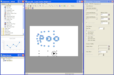
The following image shows Crystal Xcelsius in the designer mode. The Play button is commanded to increase its value from 0 to 359 degrees continuously (auto replay selected).

Tuesday, April 10, 2007

Monitoring changes over time--my best practices

Monitoring changes over time is essential in order to make better business decisions.

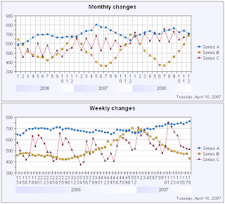
Let's start with the following two graphs. (All report objects are created with the Voyant tool. Other charting tools allow you to do corresponding graphs.)


NOTE: Series A, B, C (etc) are general placeholders for your business data--they represent any phenomena compared over time such as actual vs. budget vs. forecast, sales vs. costs, revenues by operating segment or geographic region, capacity vs. actual and planned production, etc.

These simple graphs display twelve months (52 weeks) in the year chosen from the menu above the chart. Good point: the charts are simple. Bad point: you cannot easily track changes that extend to two years or more.

To enhance the charts, let's move the year dimension into the category axis.


Now you see changes over longer periods of time (good), but the graph contains too many years--11 years!--to help you easily observe changes that are happening right now (bad).

To provide more space for the category axis, you need to limit the amount of data. It's a good idea to use selection criteria such as date >= 1st January 2006. However, using a fixed date in criteria is not good--it's better to create dynamic date criteria such as date >= 1st January previous year or date >= 1st day of current month previous year. Additionally, you often want to limit dates in the future using date <= last day of the next year or something similar. Let's see how the graphs are enhanced.


As we now live April 2007 (current date printed in the bottom-right corner of the graph), it's easy to see actual and forecasted changes at a glance.

Of course it's up to your business what is the relevant period and frequency of data: previous-current-next year, last 12 months, or something else? Monthly, weekly, or daily data? Generally it's ok to watch about 50-100 data points spread on the date axis as soon as the software presents them clearly. This equals to about 8 years of monthly data, 1.5 years of weekly data, or 3 months of daily data, such as in the following image.


Nevertheless more than hundred data points are well possible, if the software provides a date axis that scales dynamically. See the following Voyant charts with 261 weekly values (5 years, each data point in Thursday) and 396 daily values (last 12+1 months)--a lot of data but very clear. The software allows you to check the exact date by moving a mouse cursor onto a line.


Technically, it depends on the database how to create dynamic date criteria and other issues discussed above. The following examples show some methods. Feel free to use and enhance them in your own projects.

In Oracle:
  • Dates after first day of this year: WHERE date >= TRUNC(SYSDATE,'YYYY')
  • Dates after first day of previous month: WHERE date >= TRUNC(ADD_MONTHS(SYSDATE,-1),'MM')
  • Dates between previous year and next year (three years): WHERE date BETWEEN TRUNC(SYSDATE-365,'YYYY') AND TRUNC(SYSDATE+2*365,'YYYY')-1
  • Dates during the last 12 months (including this month previous year): WHERE date BETWEEN TRUNC(ADD_MONTHS(SYSDATE,-12),'MM') AND TRUNC(ADD_MONTHS(SYSDATE,1),'MM')-1

In ODBC (SQL Server, MySQL, and many others):

  • Dates after first day of this year: WHERE date >= {fn TIMESTAMPADD(SQL_TSI_DAY,-{fn DAYOFYEAR({fn CURDATE()})}+1, {fn CURDATE()})}
  • Dates after first day of previous month: WHERE date >= {fn TIMESTAMPADD(SQL_TSI_DAY,-{fn DAYOFMONTH({fn TIMESTAMPADD(SQL_TSI_MONTH,-1,{fn CURDATE()})})}+1, {fn TIMESTAMPADD(SQL_TSI_MONTH,-1,{fn CURDATE()})})}
  • Dates between previous year and next year (three years): WHERE date BETWEEN {fn TIMESTAMPADD(SQL_TSI_DAY,-{fn DAYOFYEAR({fn TIMESTAMPADD(SQL_TSI_DAY,-365,{fn CURDATE()})})}+1, {fn TIMESTAMPADD(SQL_TSI_DAY,-365,{fn CURDATE()})})} AND {fn TIMESTAMPADD(SQL_TSI_DAY,-{fn DAYOFYEAR({fn TIMESTAMPADD(SQL_TSI_DAY,2*365,{fn CURDATE()})})}, {fn TIMESTAMPADD(SQL_TSI_DAY,2*365,{fn CURDATE()})})}
  • Dates during the last 12 months (including this month previous year): WHERE date BETWEEN {fn TIMESTAMPADD(SQL_TSI_DAY,-{fn DAYOFMONTH({fn TIMESTAMPADD(SQL_TSI_MONTH,-12,{fn CURDATE()})})}+1, {fn TIMESTAMPADD(SQL_TSI_MONTH,-12,{fn CURDATE()})})} AND {fn TIMESTAMPADD(SQL_TSI_DAY,-{fn DAYOFMONTH({fn TIMESTAMPADD(SQL_TSI_MONTH,1,{fn CURDATE()})})}+1, {fn TIMESTAMPADD(SQL_TSI_MONTH,1,{fn CURDATE()})})}
You also need expressions to create years, months, weeks, etc.

In Oracle:
  • Year: TO_NUMBER(TO_CHAR(date,'YYYY'))
  • Month: TO_NUMBER(TO_CHAR(date,'MM'))
  • Year (when used with ISO standard week): TO_NUMBER(TO_CHAR(date,'IYYY'))
  • Week, ISO standard starting on Monday: TO_NUMBER(TO_CHAR(date,'IW'))
  • Day of month: TO_NUMBER(TO_CHAR(date,'DD'))
  • Date as such: date
  • Week (as a date value of Thursday = the middle day of week): date-TO_NUMBER(TO_CHAR(date,'D'))+4

In ODBC (SQL Server, MySQL, and many others):

  • Year: {fn YEAR(date)}
  • Month: {fn MONTH(date)}
  • Year (when used with ISO standard week): {fn YEAR({fn TIMESTAMPADD(SQL_TSI_DAY,-{fn MOD({fn DAYOFWEEK(date)}+5,7)}+3,date)})}
  • Week, ISO standard starting on Monday: {fn FLOOR(1+({fn DAYOFYEAR({fn TIMESTAMPADD(SQL_TSI_DAY,-{fn MOD({fn DAYOFWEEK(date)}+5,7)}+3,date)})}-1)/7)}
  • Day of month: {fn DAYOFMONTH(date)}
  • Date as such: date
  • Week (as a date value of Thursday = the middle day of week): {fn TIMESTAMPADD(SQL_TSI_DAY,-{fn MOD({fn DAYOFWEEK(date)}+5,7)}+3,date)}

Happy charting :)

Monday, April 2, 2007

Red sunsets and air quality--what chart to use?

Spring is two weeks early in Southern Finland. Ice and snow has melted, brooks and rivers are full of water, birds migrate north over the Gulf of Finland, and sunsets are beautiful reddish.

Red sunsets? They might please the eye, but also make my eyes itch when riding my bike. The red color is in fact caused by numerous air pollutants: small particles released from snow and spread all over by traffic, also from burning branches and trees. I'm waiting a heavy rain to wash the dust away.

(Aside: The Japanese flag represents the rising red sun, probably designed thousand years ago. Did the designer live in a village where people burned a lot of tree in wintertime? Did he or she understand our modern age will see in the flag a proof of air pollution?)

I'm slowly getting towards my point, data visualization, one of my key interests :)

Since the air quality is a worry to people nowadays, the largest newspaper in Finland, Helsingin Sanomat, published the following chart a few days ago.
Air quality in three different places during recent five days
Is the data output well designed? Not at all.
When air quality is good, bars are short; when bad, long. Yep. I'm able to get the information but still, the BAR CHART makes me ask in what sense bad air should be "longer" or "more" than good air?

Another thing, there are colored bands in the background to tell the air quality in words: good, satisfactory, so-so, bad, very bad. The bands for satisfactory and so-so are narrower than good and bad, while very bad is a much wider band than others. Why? Does that carry some message I should understand?

A probable explanation: The graphic designer gets exact figures of air pollutant concentrations every day. Color bands are concentration ranges defined by health care authorities. When drawing the chart, the designer hides exact numbers and adds color bands to correspond the good, satisfactory, so-so, etc air quality ranges.

But we humans don't think like this!
To us the air quality is either good or bad (or something between the opposites) without having to think which extreme is "more" and which is "less". The scale is irrelevant as soon as you can understand changes over time.
Below is my proposition how the newspaper should do it (the data is partially my imagination such as forecasted rains starting tomorrow).

In this presentation of two charts, air quality is no more a separate phenomenon but comparable to temperature and precipitation (which indeed influence the air quality). A line chart displays changes in air quality clearly. A longer period helps readers put the current air quality in context.
Much better than the original, don't you think?
How about you? Do you also share the same passion to enhance charts and tables printed in daily papers? :)