Showing posts with label crystal xcelsius. Show all posts

Tuesday, October 23, 2007

Age pyramid models

In the recent days I've read with great interests Jorge Camoes' blog about his Excel Demographic Dashboard and attempts to enhance it with Crystal Xcelsius. The Excel dashboard even contains two animated reports that help you see how the age structure in various countries and continents will change between years 1995 and 2050.

First, thanks for the information! The dashboard opened my eyes to see that the trend of growing average age is valid everywhere, including African countries (not only in Europe).

Second, thanks for a good sample! This well-documented test helps us compare BI softwares against each other.

Jorge's recent post discusses different approaches to create population pyramids with Excel (XY chart) and Crystal Xcelsius (stacked bar). Excel approach appears to me more flexible, because it allows you to draw several lines (several countries) into same age pyramid. Xcelsius falls short because Xcelsius-XY chart doesn't draw lines (only data points).

Well, let me add one more approach to the age pyramid problem.


I created the four age pyramid models by using (not XY or stacked bar but) the Sheet tool in Voyant. The software allows you to format a cell (to be precise, a column of a sheet) to display a bar or a line (instead of the number it contains).

Benefits of this approach? It's the flexibility to mix numbers and graphics together. For example, if you need more space for bars or lines, numbers will immediately move to the right, because they are part of the same sheet.

OK.

From now on, a link to Jorge Camoes' BI Blog is provided under my link list.

Monday, April 16, 2007

Crystal Xcelsius--a "what-if" analysis tool and a playful 3D demo

Crystal Xcelsius has been the first BI tool for me to learn in my new job. It's a great piece of software to create interactive "what-if" dashboards. It even lets you misuse itself in a playful fashion. See the following video (sorry about bad quality).


In the video, I first open a PowerPoint document that contains a Flash model (blue data points and play button). After starting a slide show, the play button allows me to spin data points around a 3D ball (rotating text "ESPOO" is the name of my home town).

How did I do it? See the following flowchart about the Xcelsius development process (the Flash model of course works in a browser too).


You always build an Xcelsius model based on an Excel spreadsheet. If I simplify it a little, some Excel cells are input cells (in Xcelsius, you make play buttons, sliders, check boxes, radio buttons, combo boxes, or text boxes to change their values) and some are output cells (in Xcelsius, you create charts using those).


The method of using Excel and Xcelsius together means that you end up having specifications in two places. The larger the Xcelsius model grows, the more dependencies you have between the two. Adding a third component--online database access to Excel--is possible as well. As I so far don't know the best practice to build a large Xcelsius model, I consider you rather build several independent small Xcelsius dashboards instead of a combined one.

To finally show how I created the 3D demo, below you can see the Excel speadsheet. Original data points are in B13:C62 (for example lines 13 to 25 draw the letter "E"). Cells I13:J62 are output cells for the XY chart. B5 is the input cell for the Play button.


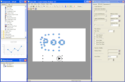
The following image shows Crystal Xcelsius in the designer mode. The Play button is commanded to increase its value from 0 to 359 degrees continuously (auto replay selected).