Showing posts with label Voyant. Show all posts

Tuesday, October 23, 2007

Age pyramid models

In the recent days I've read with great interests Jorge Camoes' blog about his Excel Demographic Dashboard and attempts to enhance it with Crystal Xcelsius. The Excel dashboard even contains two animated reports that help you see how the age structure in various countries and continents will change between years 1995 and 2050.

First, thanks for the information! The dashboard opened my eyes to see that the trend of growing average age is valid everywhere, including African countries (not only in Europe).

Second, thanks for a good sample! This well-documented test helps us compare BI softwares against each other.

Jorge's recent post discusses different approaches to create population pyramids with Excel (XY chart) and Crystal Xcelsius (stacked bar). Excel approach appears to me more flexible, because it allows you to draw several lines (several countries) into same age pyramid. Xcelsius falls short because Xcelsius-XY chart doesn't draw lines (only data points).

Well, let me add one more approach to the age pyramid problem.


I created the four age pyramid models by using (not XY or stacked bar but) the Sheet tool in Voyant. The software allows you to format a cell (to be precise, a column of a sheet) to display a bar or a line (instead of the number it contains).

Benefits of this approach? It's the flexibility to mix numbers and graphics together. For example, if you need more space for bars or lines, numbers will immediately move to the right, because they are part of the same sheet.

OK.

From now on, a link to Jorge Camoes' BI Blog is provided under my link list.

Monday, July 30, 2007

How to do enhanced project charts

My idea about enhanced project charting raised some discussion in the web forum provided by Perceptual Edge, Stephen Few's site.

Just to convince you it wasn't Excel (!), here's the dialog box to specify the color scale in Voyant:


Actually the process of creating such project charts in Voyant needs only three steps:

1. Create a projdata table and populate it with sample data (or use a corresponding table in your database).

CREATE TABLE projdata (
project_name VARCHAR(20),
day DATE,
hours DECIMAL(20,2));

After that it takes only 5 minutes:
2. By using a Sheet chart, specify four dimensions:

Measure: Hours = SUM(hours)
Rows: Project = project_name
Columns, outer dimension: Year = {fn YEAR({fn TIMESTAMPADD(SQL_TSI_DAY,-{fn MOD({fn DAYOFWEEK(day)}+5,7)}+3,day)})}
Columns, inner dimension: Week = {fn FLOOR(1+({fn DAYOFYEAR({fn TIMESTAMPADD(SQL_TSI_DAY,-{fn MOD({fn DAYOFWEEK(day)}+5,7)}+3,day)})}-1)/7)}

NOTE: The expressions above apply in SQL Server, MySQL, and other ODBC compatible databases. For other suitable expressions and how to limit the time frame, see my posting about monitoring changes over time.

3. Use the Sheet Cell Format dialog box (presented in the beginning): first for the whole chart, and second for the total row.

For the whole sheet, select Min & max determined automatically, so the color scale adapts to the greatest and least number of hours found from the data (excluding the total row).


For the total row, it's necessary to deselect Exclude totals, formulas, and cumulative numbers, so that the color scale adapts to the numbers presented in the total row.

It's also possible to use a tool tip to show the exact work hours by moving a mouse cursor over a cell of interest, as in the following image:


I hope we can soon see the color scale feature available in other OLAP tools too.

Wednesday, July 25, 2007

Viewing project data--new options available

In this posting, I will explore different ways to view project data. Some options have become available just recently.

Let's start with the well-known gantt chart. It's a great tool for project scheduling.


The gantt chart displays the start and finish date for each project. For example, the chart above shows that Project P is the longest project, starting on November 2006 finishing on August 2007.
However, a gantt chart doesn't show us how much resources each project requires.
Let's try a line chart with the same data, work hours displayed on a weekly basis.
Now we can see that project P (the longest project) doesn't require too much resources. Project K requires much more and so does A and G. You can also see the timing of these projects, that is, when the most work is done. This is important information that the gantt chart didn't tell us!
OK, let's try the area chart.
Now you can see the total resources required for all projects.
However, the line and area charts are hard to read when you have many projects. The colors of the 15 projects above are so-so distinguishable. If you have hundreds of projects, the line and area charts become useless.
Fortunately we have some new options available. Microsoft Excel calls this option "color scale" and so does Voyant's new version. Here's the same project data with Voyant.


It looks like the original gantt chart!
But instead of having just solid blue bars, now each blue bar contains much more information. First, there are weekly hours available. Second (and what is most important), the intensity of color tells us directly which project is hot and when.
If there are hundreds of projects, this kind of display still works (you just scroll down).
There's also an alternative to hide the numbers.

In the image above, the total row displays the overall resources required (red color scale).

Sunday, May 13, 2007

XY chart and graph theory

Do you know graph theory? To me it's inspiring as such. In business intelligence, a graph (in the meaning of graph theory) provides a method to visualize relationships between entities such as between people, companies, geographical locations, etc.


Hierarchical systems, where each element of the system (except for the top element) is subordinate to a single other element, are graphs too. Various organization charts and genealogy charts (both in biology and as family trees) are good examples of such graphs.

XY chart is a good way to visualize graphs. To do it clearly, at least XY must be able to:


  • Draw data points (entities)
  • Draw lines between data points to visualize existing relationships
  • Label data points (entities)
In my previous posting I already wrote about the first two aspects. The third aspect, labeling a data point, is necessary to understand the meaning of nodes of a graph.

The following step-by-step example shows a method how you can automatically create a graph by using XY and two tables graph_node (entities) and graph_link (relationships).

1. Create the graph_node and graph_link tables.

CREATE TABLE graph_node (node_id VARCHAR(3), node_name VARCHAR(40), node_order INTEGER, node_count INTEGER);
CREATE TABLE graph_link (node1_id VARCHAR(3), node2_id VARCHAR(3));

2. Populate tables with countries of Europe and border neighboring relationships (or anything you wish).


Note that I have included the node_order and node_count columns in the graph_node table. They are necessary to calculate (x, y) locations of data points later on. In a real situation, you should calculate node_order and node_count automatically by using SQL (or perhaps your OLAP system is able to calculate them on the fly).

By the way, there are 43 countries in Europe and 80 borders between them (not including Vatican and Turkey as nodes; including RUS-LTU, RUS-POL, and GBR-ESP relationships because of separate areas of Kaliningrad and Gibraltar).

3. Create a graph_link_view based on the two tables:

CREATE VIEW graph_link_view (link_id, datapoint_id, node_id)
AS
SELECT CONCAT(node1_id,node2_id), 0, node1_id FROM graph_link
UNION
SELECT CONCAT(node1_id,node2_id), 1, node2_id FROM graph_link
UNION
SELECT CONCAT(node1_id,node2_id), -1, NULL FROM graph_link
UNION
SELECT node_id, 0, node_id FROM graph_node
WHERE node_id not in (select node1_id from graph_link)
AND node_id not in (select node2_id from graph_link)
UNION
SELECT node_id, -1, NULL FROM graph_node
WHERE node_id not in (select node1_id from graph_link)
AND node_id not in (select node2_id from graph_link);

This view is necessary because of the way the XY chart draws data points and lines between them (see my previous posting). The following image shows some contents of the view:


Each row in graph_link table produces 3 rows in graph_link_view with datapoint_id values -1, 0, and 1 (0=start line, 1=finish line, -1=break line). Some nodes such as Iceland does not have border relationships with other country nodes, so it produces 2 rows into view (-1, 0).

4. Use the following query behind your report.

SELECT link.link_id, link.datapoint_id, node.node_id, node.node_name, node.node_order, node.node_count
FROM graph_link_view link
LEFT OUTER JOIN graph_node node ON link.node_id = node.node_id;

5. Create the measure dimension with the followin three calculations:

X = MIN(SIN(360*node.node_order/node.node_count/180*PI()))
Y = MIN(COS(360*node.node_order/node.node_count/180*PI()))
Label = MIN(node.node_id)

6. Create other dimensions as follows:

Outer category = link.link_id
Middle category = link.datapoint_id
Inner category = node.node_name (=serves as a tool tip label)

7. Create an XY chart and format it as follows:


The XY chart displays countries as data points in circle and border neighboring relationships between them as lines. Iceland and Malta aren't connected (they are islands).

A few notes:

I created this XY chart with the Voyant tool. It displays the data point label to the right of the data point. Additionally, when you move the mouse cursor over a data point, I specified the chart to display the inner category dimension as a tool tip (ISL data point displays "Iceland").

I explored some other OLAP charting tools whether or not it's possible to create the same XY. All of them seem to fall short in displaying data point labels, such as Excel, BusinessObjects Desktop Intelligence and Web Intelligence. Why such a useful feature is not supported by them, I don't know?

About the XY chart itself, it's actually somewhat hard to read, because the lines cross so often. Therefore I created another chart (below) in which I used longitudes and latitudes for (x, y) coordinates. Much better!


And of course, there's no meaning in displaying neighbor country relationships as a graph, because a simple map of Europe will do.

Nevertheless, the method above is ok to visualize connections found within customer relationship databases. For example, supposing your CRM database contains information about meetings (when, who, on which project), you can use this data to visualize which people were involved together in certain projects at certain time period. An XY graph visualizes this much better than a table.

I will now put an end to this posting, though I have two more issues in my mind:


  • What to do if your graph is very large?
  • Hierarchical graphs?
Later...

UPDATE (May 14, 2007): I've forgotten two borders, one between Germany and Czech Republic and another between Switzerland and Austria.

UPDATE (May 18, 2007): I recently learned that there's software for fully automated graph layout, Mathematica 6. If this functionality existed in some OLAP tool, it would be nice.

Wednesday, May 9, 2007

XY chart and a regular polygon example

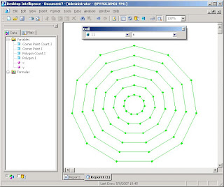
XY chart (scatter chart) is one of my favourites, because it allows you to plot your data more freely. I already used XY in the posting about Crystal Xcelsius. In this posting I will document one interesting method available in most standard OLAP tools. See the following video.


In the video, I use the first menu choice/filter to change the number of sides in a regular polygon. The second menu choice/filter allows me to decide the number of nested polygons drawn within each other.

I used the Voyant OLAP tool in the video. Can you do it too? Probably you can!

In this posting, I assume that your OLAP XY chart is capable of plotting both symbols and lines between symbols. I also assume that if some (x, y) coordinate is missing in between, then the line breaks, such as in the following sample XY chart in Excel.


Step-by-step:

1. Create a database table:

CREATE TABLE integers (i INTEGER, one INTEGER)

2. Populate the integers table with 32 rows: the i column contains numbers between -1 and 30; the one column has NULL for -1 and 1 for other numbers.

INSERT INTO integers VALUES (-1, NULL);
INSERT INTO integers VALUES (0, 1);
INSERT INTO integers VALUES (1, 1);
INSERT INTO integers VALUES (2, 1);
...
INSERT INTO integers VALUES (29, 1);
INSERT INTO integers VALUES (30, 1);

3. Create the following query behind your report:

SELECT corner_point.i, corner_point.one, corner_point_count.i, polygon.i, polygon_count.i
FROM
integers corner_point,
integers corner_point_count,
integers polygon,
integers polygon_count
WHERE corner_point.i <= corner_point_count.i

AND corner_point_count.i BETWEEN 3 AND 30
AND polygon.i <= polygon_count.i
AND polygon.i >= 1
AND polygon_count.i BETWEEN 1 AND 12;

The integers table is used in four different meanings: individual corner point, number of corner points (between 3 and 30), individual polygon, number of nested polygons (between 1 and 12).

Note that in the query, each regular polygon with n corners has n+2 corner points (-1, 0, 1, 2, 3, ..., n). One extra corner point is necessary for drawing a closed polygon. The -1 corner point is necessary to break a line before starting to draw an inner polygon (NULL corner point).

By the way, the query returns 40404 rows. Can you calculate why?

4. Create a report by using the following calculations for coordinates:

x = MIN(polygon.i/polygon_count.i*SIN(360*corner_point.i/corner_point_count.i/180*PI()*corner_point.one))
y = MIN(polygon.i/polygon_count.i*COS(360*corner_point.i/corner_point_count.i/180*PI()*corner_point.one))

Note that both calculations have *corner_point.one multiplication in it to cause the (x, y) coordinate for -1 to change into (NULL, NULL).

5. Create other dimensions as follows:

Menu 1 = corner_point_count.i
Menu 2 = polygon_count.i
Outer category = polygon.i
Inner category = corner_point.i

6. Build the report and change the chart type into XY.


7. Change into manual scale by using limits -1 and +1 for both axes. Hide the legend, axes, and unnecessary gridlines. Change all symbols to have the same color.


The report is ready!

I also tried other OLAP tools. BusinessObjects Desktop Intelligence performed well:


I tried BusinessObjects Web Intelligence / InfoView. Unfortunately the last step failed, because I wasn't able to draw lines between data points.

Then I tried Microsoft SQL Server 2000 Analysis Services, but without success. There was a couple of reasons such as: the cube editor only allows equijoins between tables while my query needs <= operators; PivotTable in Excel is not able to utilize XY chart. Has the situation changed in the 2005 Analysis Services? I don't know.

That's all for this time. Though this nested polygon example is not useful in business intelligence as such, it documents a method how you can use an XY chart to draw something new. In the following postings, I'll continue this idea and show something that is indeed very useful!

Wednesday, May 2, 2007

Self-drilling and problem solving expert system--easy job!

I continue the topic of self-drilling introduced in my previous posting. Is the following flowchart familiar to you?


It's actually a finite state machine that represents a simple expert system driven by questions and aswers. In the database you can model the flowchart by using two tables: exp_state and exp_transition.


By using self-drilling reports and Voyant, I created an expert system OLAP model. See the following video:


It was quite easy. My solution is general. If you'd put thousands of questions and answers in the exp_state and exp_transition tables, it would work as perfectly as in the video. (There's no limit on the number of optional answers per question or the length of questions and answers.)

I call this a simple expert system, because a true expert system should allow fuzzy logic (probabilities between 0 and 1), which this system does not do. Also a true expert system should be able to calculate costs (or something else) based on the choices made by the user.

Sunday, April 29, 2007

Self-drilling and finite state machines, does your OLAP tool support them?

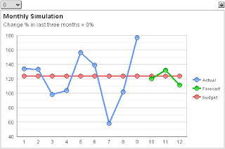
Self-drilling, drilling down to itself, is an interesting concept in business intelligence reports. Among many things, it allows your OLAP tool to turn into a simulation tool much like Crystal Xcelsius. See the following video:


In the video, I'm working with the Voyant OLAP tool and a line chart. I click several times a meter control = the simulated change percent for the last three months of the year (between -100% and +100%). When clicking, the forecast (green line) moves accordingly.

How did I do it? Self-drilling is the key.

Step-by-step (please try it with your OLAP tool):

1. Create a new table: CREATE TABLE sim_change_percent (change_percent INTEGER)

2. Populate the table with integers between -100 and 100 = 201 rows.

3. Define a query for your report: SELECT choice.change_percent "Choice", display.change_percent "Display" FROM sim_change_percent choice, sim_change_percent display WHERE choice.change_percent <> display.change_percent

Please note that the two instances of the sim_change_percent table "choice" and "display" are joined by <> operator. The query produces 201 x 200 rows = 40 200 rows.

4. Create a stacked column graph where you use:
  • Legend of the chart = measure dimension = COUNT(*)
  • Category axis = Display column of the query
  • Menu choice/filter = Choice column of the query
The report looks like this:


Note that every column height is one (that's because of COUNT(*)). Also note that when you have chosen a zero percent from the menu choice/filter above the report, the corresponding column is missing from the chart (that's because of the <> operator).

5. Add a formula/calculation to the measure dimension: 1-[count]

This fills the gap in the stacked column chart. Because there are two members in the legend, you can use different colors for them to show which one is selected. The next image shows colors changed and boundary lines removed.

6. Now to self-drilling: Whichever way it's done in your OLAP tool, specify that clicking a column drills down to the menu choice/filter of the same report.

In Voyant, you do this by specifying interaction options.

7. Change the visual display by removing the legend and both axes. Specify the gap width between columns to 0%. Add explanatory texts (titles, subtitles, footers, etc) around the meter control to make it more comprehensible. Also add a tool tip (called a chart tip in Voyant) to display a change percentage near the mouse cursor.


Thanks to self-drilling, the stacked column chart now looks and performs like a meter control.

Let's continue to the line chart with Actual, Forecast, and Budget:

8. Create a new table: CREATE TABLE sim_money (month INTEGER, actual DOUBLE PRECISION, forecast DOUBLE PRECISION, budget DOUBLE PRECISION)

9. Populate the sim_money table with the following numbers (12 rows):


10. Define a query for your line chart report: SELECT month, change_percent, actual, forecast, budget FROM sim_money, sim_change_percent

The idea of the query above is to not join at all the sim_money and sim_change_percent tables. This cartesian product gives us 12 x 201 rows = 2412 rows.

11. Specify a line chart by:

  • Legend of the chart = measure dimension = SUM(actual), SUM(forecast*(100+change_percent)/100), SUM(budget)
  • Category axis = month column of the query
  • Menu choice/filter = change_percent column of the query
After enhancing the visual display the line chart might look like this:


12. Position the two charts as in the following image, hide the menus, and make them synchronized.


Synchronization means that both reports share a global menu choice/filter (change percentage with 201 choices). Neither of the menus/filters need to be visible, because the meter control enables you choose by clicking.

The simulation model is ready. Please leave a comment, if your OLAP tool is able to do it.

Additional notes about self-drilling:
  • When using self-drilling, you always need a query with a cartesian product.
  • Self-drilling makes simulation models available in OLAP tools. If a report uses two simulation variables, you need two cartesian products in the query, etc.
  • In a larger perspective, self-drilling allows you to create finite state machine models. Transitions between states are performed by mouse clicks.
  • A finite-state-machine way of thinking allows you to create versatile navigational systems. This includes a simple expert system, where a series of questions and answers help a user solve a specific problem. For example, rows of a sheet contain different choices (answers) that take you to the next state (the next question and the next set of answers).
  • Because of one or more cartesian products that exist behind self-drilling systems, the number of rows included in calculation grow easily very large. Thus, OLAP tools that store all the data in RAM become more easily out of action. Self-drilling works best with online data access from a database.

PS. Self-drilling as an idea and as a term are my independent inventions, as well as the ways to utilize the concept. Please leave a comment, if you know somebody uses a different terminology about the matter.

Tuesday, April 10, 2007

Monitoring changes over time--my best practices

Monitoring changes over time is essential in order to make better business decisions.

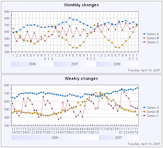
Let's start with the following two graphs. (All report objects are created with the Voyant tool. Other charting tools allow you to do corresponding graphs.)


NOTE: Series A, B, C (etc) are general placeholders for your business data--they represent any phenomena compared over time such as actual vs. budget vs. forecast, sales vs. costs, revenues by operating segment or geographic region, capacity vs. actual and planned production, etc.

These simple graphs display twelve months (52 weeks) in the year chosen from the menu above the chart. Good point: the charts are simple. Bad point: you cannot easily track changes that extend to two years or more.

To enhance the charts, let's move the year dimension into the category axis.


Now you see changes over longer periods of time (good), but the graph contains too many years--11 years!--to help you easily observe changes that are happening right now (bad).

To provide more space for the category axis, you need to limit the amount of data. It's a good idea to use selection criteria such as date >= 1st January 2006. However, using a fixed date in criteria is not good--it's better to create dynamic date criteria such as date >= 1st January previous year or date >= 1st day of current month previous year. Additionally, you often want to limit dates in the future using date <= last day of the next year or something similar. Let's see how the graphs are enhanced.


As we now live April 2007 (current date printed in the bottom-right corner of the graph), it's easy to see actual and forecasted changes at a glance.

Of course it's up to your business what is the relevant period and frequency of data: previous-current-next year, last 12 months, or something else? Monthly, weekly, or daily data? Generally it's ok to watch about 50-100 data points spread on the date axis as soon as the software presents them clearly. This equals to about 8 years of monthly data, 1.5 years of weekly data, or 3 months of daily data, such as in the following image.


Nevertheless more than hundred data points are well possible, if the software provides a date axis that scales dynamically. See the following Voyant charts with 261 weekly values (5 years, each data point in Thursday) and 396 daily values (last 12+1 months)--a lot of data but very clear. The software allows you to check the exact date by moving a mouse cursor onto a line.


Technically, it depends on the database how to create dynamic date criteria and other issues discussed above. The following examples show some methods. Feel free to use and enhance them in your own projects.

In Oracle:
  • Dates after first day of this year: WHERE date >= TRUNC(SYSDATE,'YYYY')
  • Dates after first day of previous month: WHERE date >= TRUNC(ADD_MONTHS(SYSDATE,-1),'MM')
  • Dates between previous year and next year (three years): WHERE date BETWEEN TRUNC(SYSDATE-365,'YYYY') AND TRUNC(SYSDATE+2*365,'YYYY')-1
  • Dates during the last 12 months (including this month previous year): WHERE date BETWEEN TRUNC(ADD_MONTHS(SYSDATE,-12),'MM') AND TRUNC(ADD_MONTHS(SYSDATE,1),'MM')-1

In ODBC (SQL Server, MySQL, and many others):

  • Dates after first day of this year: WHERE date >= {fn TIMESTAMPADD(SQL_TSI_DAY,-{fn DAYOFYEAR({fn CURDATE()})}+1, {fn CURDATE()})}
  • Dates after first day of previous month: WHERE date >= {fn TIMESTAMPADD(SQL_TSI_DAY,-{fn DAYOFMONTH({fn TIMESTAMPADD(SQL_TSI_MONTH,-1,{fn CURDATE()})})}+1, {fn TIMESTAMPADD(SQL_TSI_MONTH,-1,{fn CURDATE()})})}
  • Dates between previous year and next year (three years): WHERE date BETWEEN {fn TIMESTAMPADD(SQL_TSI_DAY,-{fn DAYOFYEAR({fn TIMESTAMPADD(SQL_TSI_DAY,-365,{fn CURDATE()})})}+1, {fn TIMESTAMPADD(SQL_TSI_DAY,-365,{fn CURDATE()})})} AND {fn TIMESTAMPADD(SQL_TSI_DAY,-{fn DAYOFYEAR({fn TIMESTAMPADD(SQL_TSI_DAY,2*365,{fn CURDATE()})})}, {fn TIMESTAMPADD(SQL_TSI_DAY,2*365,{fn CURDATE()})})}
  • Dates during the last 12 months (including this month previous year): WHERE date BETWEEN {fn TIMESTAMPADD(SQL_TSI_DAY,-{fn DAYOFMONTH({fn TIMESTAMPADD(SQL_TSI_MONTH,-12,{fn CURDATE()})})}+1, {fn TIMESTAMPADD(SQL_TSI_MONTH,-12,{fn CURDATE()})})} AND {fn TIMESTAMPADD(SQL_TSI_DAY,-{fn DAYOFMONTH({fn TIMESTAMPADD(SQL_TSI_MONTH,1,{fn CURDATE()})})}+1, {fn TIMESTAMPADD(SQL_TSI_MONTH,1,{fn CURDATE()})})}
You also need expressions to create years, months, weeks, etc.

In Oracle:
  • Year: TO_NUMBER(TO_CHAR(date,'YYYY'))
  • Month: TO_NUMBER(TO_CHAR(date,'MM'))
  • Year (when used with ISO standard week): TO_NUMBER(TO_CHAR(date,'IYYY'))
  • Week, ISO standard starting on Monday: TO_NUMBER(TO_CHAR(date,'IW'))
  • Day of month: TO_NUMBER(TO_CHAR(date,'DD'))
  • Date as such: date
  • Week (as a date value of Thursday = the middle day of week): date-TO_NUMBER(TO_CHAR(date,'D'))+4

In ODBC (SQL Server, MySQL, and many others):

  • Year: {fn YEAR(date)}
  • Month: {fn MONTH(date)}
  • Year (when used with ISO standard week): {fn YEAR({fn TIMESTAMPADD(SQL_TSI_DAY,-{fn MOD({fn DAYOFWEEK(date)}+5,7)}+3,date)})}
  • Week, ISO standard starting on Monday: {fn FLOOR(1+({fn DAYOFYEAR({fn TIMESTAMPADD(SQL_TSI_DAY,-{fn MOD({fn DAYOFWEEK(date)}+5,7)}+3,date)})}-1)/7)}
  • Day of month: {fn DAYOFMONTH(date)}
  • Date as such: date
  • Week (as a date value of Thursday = the middle day of week): {fn TIMESTAMPADD(SQL_TSI_DAY,-{fn MOD({fn DAYOFWEEK(date)}+5,7)}+3,date)}

Happy charting :)

Thursday, March 29, 2007

My DW success story

Data warehousing does have an influence on the society.

This one I noted in Finland after having created a DW for the Central Union of Agricultural Producers and Forest Owners (in Finnish MTK). See the chart below (FYI, texts are in Finnish).


In 2005, timber price (fir, pine) was less than 48 €/m3. After reports and charts (such as the one above) were published on the web in the end of 2005, log prices have risen more than 20% soon breaking up 60 €/m3.

What happened? Before the system was published 300,000 (three hundred thousand) Finnish forest owners were in bad market situation against three giant pulp mill companies that buy most of timber. By voluntarily sharing price information the forest owners as well as their local associations became more aware about the market. (There was also other factors increasing log price such as a change in forest taxation, but that's another story.)

Technically, the data is extracted from the databases of 150 timber associations around the country (each association decides how often). If a forest owner uses the local association to sell timber (40% of cases), the data is later on loaded into a central database (we use our own ETL tool JobRunner for that). Finally, the Voyant OLAP tool made it possible to publish the information clearly on MTK's website.

By the way, the three pulp mill companies are now in court accused of controlling log prices against antitrust laws (more information here). Will there emerge a new timber purchasing cartel in Finland some day? Because of the DW, I doubt.

Wednesday, March 28, 2007

Hello world

While I soon start to work in Affecto, one of the largest business intelligence companies in Northern Europe, it's a good moment to start blogging about BI.

About my background, I have 16 years of history in business intelligence. All these years I've been in the developer side, creating an OLAP tool Voyant. I'm proud to tell that the software has been appreciated by customers for its ease of use and productivity, nevertheless it has not gained a big success.

Data visualization is one of my key interests, so my goal is to include an image or two in every posting. The next one is a dashboard I once made to express Voyant's elegant customizable web interface (click here for an online web demo).


For those of you being technically interested, Voyant relies on lightweight Java applets in the browser environment (three applets in the example above). The Server version delivers data between database and applets. The Designer and Analyst desktop versions are for specifying report objects and their interaction.

Outside of data visualization (and Voyant), I'll plan to write about good and bad sides of those OLAP/BI tools I'll be working with as a consultant during the following months.

I hope my BI background will help me see and write about business intelligence in a fresh way.