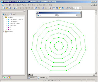
In the video, I use the first menu choice/filter to change the number of sides in a regular polygon. The second menu choice/filter allows me to decide the number of nested polygons drawn within each other.
I used the Voyant OLAP tool in the video. Can you do it too? Probably you can!
In this posting, I assume that your OLAP XY chart is capable of plotting both symbols and lines between symbols. I also assume that if some (x, y) coordinate is missing in between, then the line breaks, such as in the following sample XY chart in Excel.

Step-by-step:
1. Create a database table:
CREATE TABLE integers (i INTEGER, one INTEGER)
2. Populate the integers table with 32 rows: the i column contains numbers between -1 and 30; the one column has NULL for -1 and 1 for other numbers.
INSERT INTO integers VALUES (-1, NULL);
INSERT INTO integers VALUES (0, 1);
INSERT INTO integers VALUES (1, 1);
INSERT INTO integers VALUES (2, 1);
...
INSERT INTO integers VALUES (29, 1);
INSERT INTO integers VALUES (30, 1);
3. Create the following query behind your report:
SELECT corner_point.i, corner_point.one, corner_point_count.i, polygon.i, polygon_count.i
FROM
integers corner_point,
integers corner_point_count,
integers polygon,
integers polygon_count
WHERE corner_point.i <= corner_point_count.i
AND corner_point_count.i BETWEEN 3 AND 30
AND polygon.i <= polygon_count.i
AND polygon.i >= 1
AND polygon_count.i BETWEEN 1 AND 12;
The integers table is used in four different meanings: individual corner point, number of corner points (between 3 and 30), individual polygon, number of nested polygons (between 1 and 12).
Note that in the query, each regular polygon with n corners has n+2 corner points (-1, 0, 1, 2, 3, ..., n). One extra corner point is necessary for drawing a closed polygon. The -1 corner point is necessary to break a line before starting to draw an inner polygon (NULL corner point).
By the way, the query returns 40404 rows. Can you calculate why?
4. Create a report by using the following calculations for coordinates:
x = MIN(polygon.i/polygon_count.i*SIN(360*corner_point.i/corner_point_count.i/180*PI()*corner_point.one))
y = MIN(polygon.i/polygon_count.i*COS(360*corner_point.i/corner_point_count.i/180*PI()*corner_point.one))
Note that both calculations have *corner_point.one multiplication in it to cause the (x, y) coordinate for -1 to change into (NULL, NULL).
5. Create other dimensions as follows:
Menu 1 = corner_point_count.i
Menu 2 = polygon_count.i
Outer category = polygon.i
Inner category = corner_point.i
6. Build the report and change the chart type into XY.

7. Change into manual scale by using limits -1 and +1 for both axes. Hide the legend, axes, and unnecessary gridlines. Change all symbols to have the same color.

The report is ready!
I also tried other OLAP tools. BusinessObjects Desktop Intelligence performed well:

I tried BusinessObjects Web Intelligence / InfoView. Unfortunately the last step failed, because I wasn't able to draw lines between data points.
Then I tried Microsoft SQL Server 2000 Analysis Services, but without success. There was a couple of reasons such as: the cube editor only allows equijoins between tables while my query needs <= operators; PivotTable in Excel is not able to utilize XY chart. Has the situation changed in the 2005 Analysis Services? I don't know.
That's all for this time. Though this nested polygon example is not useful in business intelligence as such, it documents a method how you can use an XY chart to draw something new. In the following postings, I'll continue this idea and show something that is indeed very useful!
No comments:
Post a Comment