Sunday, August 12, 2007

Observations about Edward Tufte's classic The Visual Display of Quantitative Information

More than two months ago I read a book The Visual Display of Quantitative Information by Edward Tufte.

Many already know this classic (1st edition 1981, 2nd 2001) that introduces the first theoretical view of statistical graphics. Instead of writing a full review, I will tell what I liked most.

In the end of this post, you'll also find a comparison of this book and Stephen Few's Information Dashboard Design.


1. History

I enjoyed reading where all started. We don't know who invented traditional Chinese characters. We know only according to legends that the inventor of Greec alphabet was Cadmus. But for sure we know who invented line and bar charts. He was William Playfair (1759-1823). Here's one of his piece of art (its copyright has expired):


For Playfair, graphics were preferable to tables because graphics showed the shape of the data in a comparative perspective. The line chart easily contained data of hundred years displaying for example imports and exports or the national debt of Britain. Colonial wars caused rises and falls thus proving that the government policy has its economic consequences.

2. More history

The book contains many other examples of graphical art too. As in early days every graphic was cut into metal or stone surface as a mirror image, surely each piece of graphic is more valuable and special compared to our moders graphics. Here's a masterpiece from Charles Joseph Minard (its copyright has expired):


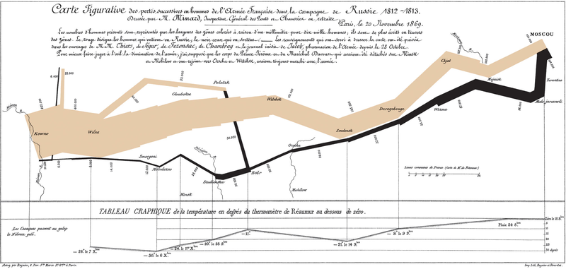
The well-known graphic shows the terrible fate of Napoleon's army in Russia during 1812-1813. Starting from Poland on the left the size of the army is 422,000. While going towards east the width of the gray band indicates the diminishing size of the army at each place on the map. In Moscow there are 100,000 men left. Going back to Poland the dark line becomes thinner and thinner thus displaying devastating losses. In Tufte's words: It may well be the best statistical graphic ever drawn.

3. Scatterplots

Tufte uses 23 pages of 197 (11.7%) to talk about XY charts. I'm impressed about the difference he makes between XY and other charts, because I feel the same. Tufte's words: [...] the scatterplot and its variants ... [are] the greatest of all graphical designs. It links at least two variables, encouraging and even imploring the viewer to assess the possible causal relationship between the plotted variables.

In fact, when I read Helsingin Sanomat, the largest newspaper in Finland, I from time to time see it losing the possibility to use XY. The following image was published by the newspaper about the population growth rate in twenty cities of Finland (translated in English).


Here is my view of the same data by using a scatterplot:


Some cities grow fast (top-right corner) both because of natural population growth and positive net migration, while for example the lowest city Kajaani has a problem with negative net migration (-5%). A national decision-maker would appreciate this XY chart, as it clearly shows which cities are alike and which aren't.

4. Small multiples

Small multiples is something I haven't paid attention, when I was a programmer. The idea is great. See how much information is contained in the following set of charts.


Unfortunately, to create small multiples with a modern charting application is far from straightforward. For example, when composing the sample image above, I had to size and position six charts precisely to form a satisfactory result. Another bad point: Individual charts tend to have a different automatic scale in Y axis, which is a problem, when you quickly try to get grip of the data.

5. New concepts introduced

To me it's fun to learn what concepts others have invented. In this book Tufte introduces a couple of them, of which the data-ink ratio is most well-known: above all else show the data, maximize the data-ink ratio, erase non-data-ink and redundant data-ink, revise and edit.

Other concepts such as lie factor and data density I also find interesting. Lie factor: show data variation, not design variation. Data density: the small multiples chart above is an example of a high-information graphics = you don’t have to repeat titles or legends for every individual chart.

Data visualization books in comparison

As I have previously reviewed Stephen Few's Information Dashboard Design [link] that also discusses about data visualization, here's my observations how these great books differ:


By the way, there are newer books from Tufte available such as Beautiful Evidence, but I haven’t read it yet.

Monday, July 30, 2007

How to do enhanced project charts

My idea about enhanced project charting raised some discussion in the web forum provided by Perceptual Edge, Stephen Few's site.

Just to convince you it wasn't Excel (!), here's the dialog box to specify the color scale in Voyant:


Actually the process of creating such project charts in Voyant needs only three steps:

1. Create a projdata table and populate it with sample data (or use a corresponding table in your database).

CREATE TABLE projdata (
project_name VARCHAR(20),
day DATE,
hours DECIMAL(20,2));

After that it takes only 5 minutes:
2. By using a Sheet chart, specify four dimensions:

Measure: Hours = SUM(hours)
Rows: Project = project_name
Columns, outer dimension: Year = {fn YEAR({fn TIMESTAMPADD(SQL_TSI_DAY,-{fn MOD({fn DAYOFWEEK(day)}+5,7)}+3,day)})}
Columns, inner dimension: Week = {fn FLOOR(1+({fn DAYOFYEAR({fn TIMESTAMPADD(SQL_TSI_DAY,-{fn MOD({fn DAYOFWEEK(day)}+5,7)}+3,day)})}-1)/7)}

NOTE: The expressions above apply in SQL Server, MySQL, and other ODBC compatible databases. For other suitable expressions and how to limit the time frame, see my posting about monitoring changes over time.

3. Use the Sheet Cell Format dialog box (presented in the beginning): first for the whole chart, and second for the total row.

For the whole sheet, select Min & max determined automatically, so the color scale adapts to the greatest and least number of hours found from the data (excluding the total row).


For the total row, it's necessary to deselect Exclude totals, formulas, and cumulative numbers, so that the color scale adapts to the numbers presented in the total row.

It's also possible to use a tool tip to show the exact work hours by moving a mouse cursor over a cell of interest, as in the following image:


I hope we can soon see the color scale feature available in other OLAP tools too.

Wednesday, July 25, 2007

Viewing project data--new options available

In this posting, I will explore different ways to view project data. Some options have become available just recently.

Let's start with the well-known gantt chart. It's a great tool for project scheduling.


The gantt chart displays the start and finish date for each project. For example, the chart above shows that Project P is the longest project, starting on November 2006 finishing on August 2007.
However, a gantt chart doesn't show us how much resources each project requires.
Let's try a line chart with the same data, work hours displayed on a weekly basis.
Now we can see that project P (the longest project) doesn't require too much resources. Project K requires much more and so does A and G. You can also see the timing of these projects, that is, when the most work is done. This is important information that the gantt chart didn't tell us!
OK, let's try the area chart.
Now you can see the total resources required for all projects.
However, the line and area charts are hard to read when you have many projects. The colors of the 15 projects above are so-so distinguishable. If you have hundreds of projects, the line and area charts become useless.
Fortunately we have some new options available. Microsoft Excel calls this option "color scale" and so does Voyant's new version. Here's the same project data with Voyant.


It looks like the original gantt chart!
But instead of having just solid blue bars, now each blue bar contains much more information. First, there are weekly hours available. Second (and what is most important), the intensity of color tells us directly which project is hot and when.
If there are hundreds of projects, this kind of display still works (you just scroll down).
There's also an alternative to hide the numbers.

In the image above, the total row displays the overall resources required (red color scale).

Tuesday, June 5, 2007

3D calculation example

I have been asked how to create 3D rotation as in the posting about Crystal Xcelsius.

When x, y, and z go like in the image below, and x = longitude 0, and y = longitude 90 degrees, then for arbitrary latitude and longitude:
x = r * sin(longitude) * cos(latitude)
y = r * cos(longitude) * cos(latitude)
z = r * sin(latitude)

.. where r = radius of ball.
When you add the eye (watching point) to the image, then for arbitrary point a in coordinates (xa, ya, za), you can calculate point a' (xa', ya') in the plane between eye and ball.
The next image helps understand how you calculate ya' in the plane:
xa' = ya/(d-xa)
ya' = za/(d-xa)
.. or if you want to put little less perspective, you can do:
xa' = arctan(ya/(d-xa))
ya' = arctan(za/(d-xa))
The point a' (xa', ya') is input for the XY chart.

Wednesday, May 23, 2007

SQL trick for flattening a parent-child table and vice versa

Among other things this blog is about saving tricks for future use. This SQL trick I used in my previous example of hierarchical organization structure = How to flatten a parent-child table.

Suppose you have the following parent-child table for your hierarchy:

CREATE TABLE hierarchy_parent_child (
node_id INTEGER NOT NULL,
parent_id INTEGER,
node_name VARCHAR(40)
);


.. and the table contains data like this (please note NULL in root parent_id):


.. and you want to change it into flat format, here's the SQL:

SELECT
lev01.node_id id_01, lev01.node_name name_01,
lev02.node_id id_02, lev02.node_name name_02,
lev03.node_id id_03, lev03.node_name name_03,
lev04.node_id id_04, lev04.node_name name_04,
lev05.node_id id_05, lev05.node_name name_05,
lev06.node_id id_06, lev06.node_name name_06,
lev07.node_id id_07, lev07.node_name name_07,
lev08.node_id id_08, lev08.node_name name_08,
lev09.node_id id_09, lev09.node_name name_09,
lev10.node_id id_10, lev10.node_name name_10
FROM hierarchy_parent_child lev01
LEFT OUTER JOIN hierarchy_parent_child lev02 ON lev01.node_id = lev02.parent_id
LEFT OUTER JOIN hierarchy_parent_child lev03 ON lev02.node_id = lev03.parent_id
LEFT OUTER JOIN hierarchy_parent_child lev04 ON lev03.node_id = lev04.parent_id
LEFT OUTER JOIN hierarchy_parent_child lev05 ON lev04.node_id = lev05.parent_id
LEFT OUTER JOIN hierarchy_parent_child lev06 ON lev05.node_id = lev06.parent_id
LEFT OUTER JOIN hierarchy_parent_child lev07 ON lev06.node_id = lev07.parent_id
LEFT OUTER JOIN hierarchy_parent_child lev08 ON lev07.node_id = lev08.parent_id
LEFT OUTER JOIN hierarchy_parent_child lev09 ON lev08.node_id = lev09.parent_id
LEFT OUTER JOIN hierarchy_parent_child lev10 ON lev09.node_id = lev10.parent_id
WHERE lev01.parent_id IS NULL;


.. then it returns rows like this:


The example above works for ten levels but it's easy to add more levels by repeating the pattern.

If you want to go vice versa, suppose you have the following flat hierarchy table:

CREATE TABLE hierarchy_flat (
id_01 INTEGER,
name_01 VARCHAR(40),
id_02 INTEGER,
name_02 VARCHAR(40),
id_03 INTEGER,
name_03 VARCHAR(40),
id_04 INTEGER,
name_04 VARCHAR(40),
id_05 INTEGER,
name_05 VARCHAR(40),
id_06 INTEGER,
name_06 VARCHAR(40),
id_07 INTEGER,
name_07 VARCHAR(40),
id_08 INTEGER,
name_08 VARCHAR(40),
id_09 INTEGER,
name_09 VARCHAR(40),
id_10 INTEGER,
name_19 VARCHAR(40)

);

.. then you can do SQL like this:

SELECT DISTINCT id_01 node_id, NULL parent_id, name_01 node_name
FROM hierarchy_flat
UNION
SELECT DISTINCT id_02 node_id, id_01 parent_id, name_02 node_name
FROM hierarchy_flat WHERE id_02 IS NOT NULL
UNION
SELECT DISTINCT id_03 node_id, id_02 parent_id, name_03 node_name
FROM hierarchy_flat WHERE id_03 IS NOT NULL
UNION
SELECT DISTINCT id_04 node_id, id_03 parent_id, name_04 node_name
FROM hierarchy_flat WHERE id_04 IS NOT NULL
UNION
SELECT DISTINCT id_05 node_id, id_04 parent_id, name_05 node_name
FROM hierarchy_flat WHERE id_05 IS NOT NULL
UNION
SELECT DISTINCT id_06 node_id, id_05 parent_id, name_06 node_name
FROM hierarchy_flat WHERE id_06 IS NOT NULL
UNION
SELECT DISTINCT id_07 node_id, id_06 parent_id, name_07 node_name
FROM hierarchy_flat WHERE id_07 IS NOT NULL
UNION
SELECT DISTINCT id_08 node_id, id_07 parent_id, name_08 node_name
FROM hierarchy_flat WHERE id_08 IS NOT NULL
UNION
SELECT DISTINCT id_09 node_id, id_08 parent_id, name_09 node_name
FROM hierarchy_flat WHERE id_09 IS NOT NULL

UNION
SELECT DISTINCT id_10 node_id, id_09 parent_id, name_10 node_name
FROM hierarchy_flat WHERE id_10 IS NOT NULL

ORDER BY 1

.. and you get the original parent-child table.

Again, repeat the pattern to enable more than ten levels.